
Quick Answer
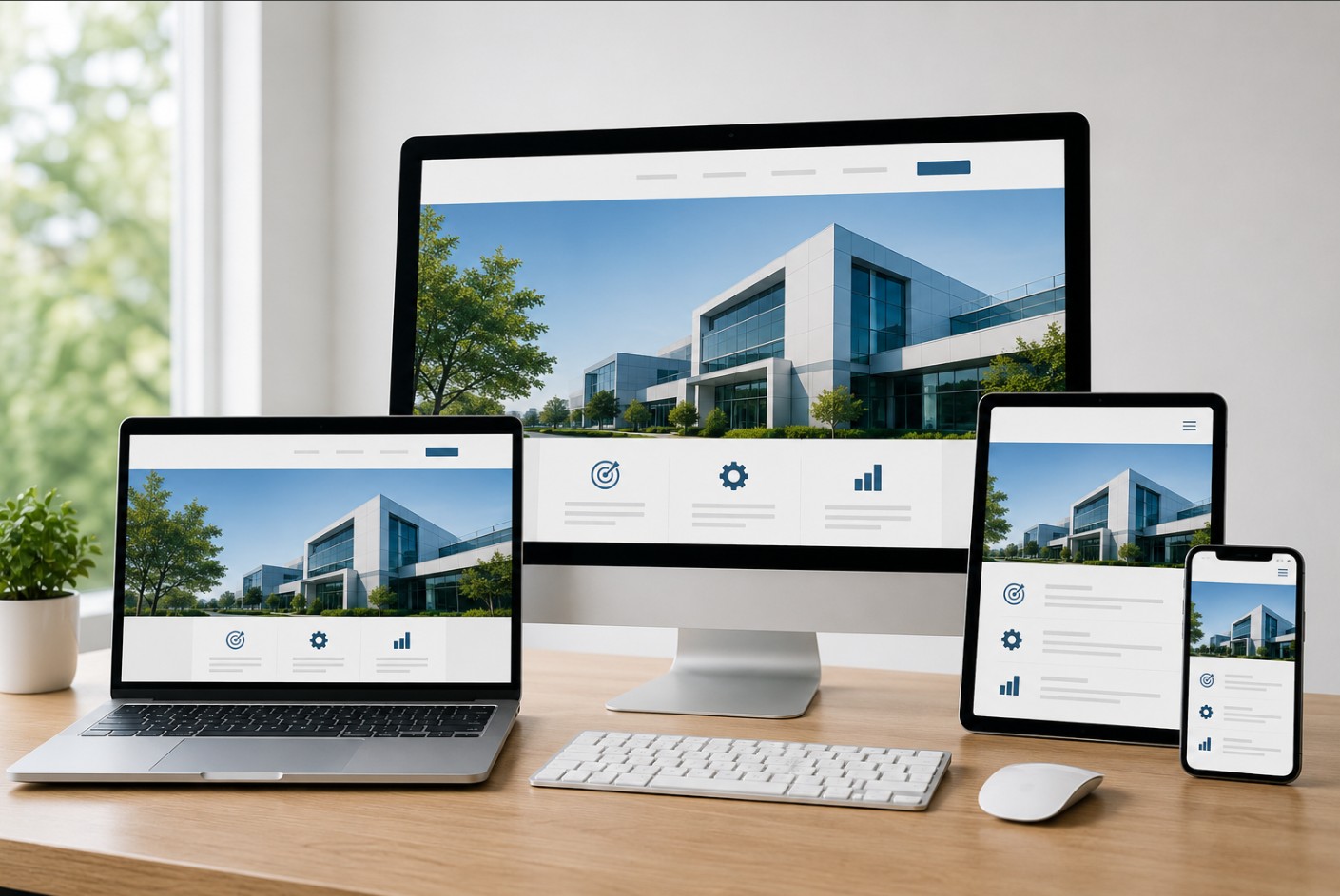
What Is Responsive Web Design? Responsive web design is an approach to website development that automatically adjusts a website’s layout, images, and content to fit different screen sizes and devices. Whether visitors use a desktop, laptop, tablet, or smartphone, a responsive website delivers an optimized browsing experience that improves usability, SEO, and overall website performance.
Table of Contents
- Introduction
- What Is Responsive Web Design?
- Why Responsive Web Design Matters
- How Responsive Web Design Works
- Key Features of Responsive Websites
- Devices Supported by Responsive Websites
- Why Mobile-Friendly Websites Are Essential
- Responsive Web Design and User Experience
- Responsive Web Design and SEO
- Common Elements of a Responsive Website
- Best Practices
- Common Mistakes
- Why Choose VOIEBIZ
- Conclusion
- Frequently Asked Questions
- About the Author
Introduction
Today, people browse websites using a wide variety of devices. Some visitors use desktop computers at work, while others search for products and services on smartphones or tablets.
If your website doesn’t display correctly across different screen sizes, visitors may struggle to navigate your pages, read your content, or contact your business. This often leads to higher bounce rates and lost business opportunities.
This is why responsive web design has become an essential part of modern website development.
Whether you operate a small business or a large enterprise, a responsive website ensures every visitor enjoys a smooth browsing experience regardless of the device they use.
In this guide, you’ll learn what responsive web design is, how it works, why it matters for businesses in the UAE, and how it supports better SEO, improved user experience, and long-term business growth.
What Is Responsive Web Design?
Responsive web design is a website development approach that automatically adapts your website to different screen sizes without creating separate versions for desktop and mobile users.
Instead of designing multiple websites for different devices, responsive websites use flexible layouts that adjust according to the visitor’s screen.
This allows users to enjoy the same content and functionality whether they access your website from:
- Desktop computers
- Laptop computers
- Tablets
- Smartphones
- Large display screens
A responsive website provides consistent branding, navigation, and functionality across every device.
Why Responsive Web Design Matters
Customer expectations continue to evolve.
Visitors expect websites to load quickly, display correctly, and provide an excellent experience regardless of the device they use.
A responsive website helps businesses:
- Reach more customers
- Improve user satisfaction
- Reduce bounce rates
- Increase conversions
- Build trust
- Improve search engine visibility
- Support long-term business growth
Without responsive design, users may leave your website if they experience navigation issues or unreadable content.
How Responsive Web Design Works
Responsive websites use modern web development techniques to adjust page layouts automatically.
Instead of creating separate mobile and desktop websites, responsive development uses:
Flexible Layouts
Website sections automatically expand or shrink depending on screen size.
Flexible Images
Images resize proportionally so they display correctly without affecting website performance.
Responsive Navigation
Menus adapt to different devices, often changing into mobile-friendly navigation on smaller screens.
Scalable Typography
Text automatically adjusts to remain easy to read across different screen sizes.
Media Queries
Modern CSS media queries allow developers to apply different styles based on the visitor’s device and screen width.
Together, these technologies create a consistent browsing experience across all devices.
Key Features of Responsive Websites
Professional Responsive Website Development includes several important features.
Mobile-Friendly Layout
Content automatically adjusts for smartphones and tablets.
Fast Loading Performance
Responsive websites are optimized to load efficiently across different internet connections.
Easy Navigation
Menus remain simple and user-friendly regardless of screen size.
Flexible Images
Images scale correctly without appearing stretched or distorted.
Readable Content
Visitors can easily read text without zooming or horizontal scrolling.
Optimized User Experience
Responsive layouts improve accessibility and make it easier for users to interact with your website.
Cross-Browser Compatibility
Professional websites are tested across modern browsers to ensure consistent performance.
Devices Supported by Responsive Websites
A professionally developed responsive website should function effectively across a wide range of devices.
These include:
- Desktop Computers
- Laptop Computers
- Android Smartphones
- iPhones
- Tablets
- Foldable Devices
- Large Monitors
- High-Resolution Displays
Supporting multiple devices helps businesses reach a wider audience without maintaining separate websites.
Why Mobile-Friendly Websites Are Essential
Mobile devices now account for a significant portion of internet traffic.
Customers regularly search for:
- Products
- Services
- Local businesses
- Contact information
- Reviews
using smartphones.
If your website isn’t optimized for mobile users, potential customers may quickly leave and choose another business.
Responsive Web Design helps businesses:
- Improve accessibility
- Increase engagement
- Reduce bounce rates
- Improve lead generation
- Support better search rankings
For businesses in Sharjah and across the UAE, mobile-friendly websites have become a necessity rather than an option.
Responsive Web Design and User Experience
User experience plays a major role in website success.
A responsive website allows visitors to:
- Navigate easily
- Read content comfortably
- Complete enquiry forms
- Browse products
- Contact your business
- Access information quickly
When visitors enjoy using your website, they are more likely to remain on your pages, explore additional content, and become customers.
Responsive Web Design and SEO
Google recommends responsive web design because it provides a consistent experience across devices.
A responsive website supports SEO through:
- Better mobile usability
- Faster page loading
- Lower bounce rates
- Improved user engagement
- Easier website management
- Better crawling and indexing
Professional Website Design Services should always incorporate responsive development as part of the overall SEO strategy.
Common Elements of a Responsive Website
Most responsive websites include:
- Responsive header
- Flexible content sections
- Mobile navigation menu
- Responsive images
- Optimized contact forms
- Click-to-call buttons
- Interactive maps
- Mobile-friendly buttons
- Optimized typography
- Responsive footer
These elements work together to provide visitors with a seamless browsing experience across all devices.
Responsive Web Design vs Mobile Website
Many business owners think a responsive website and a mobile website are the same, but they are different approaches.
| Responsive Web Design | Mobile Website |
|---|---|
| One website for all devices | Separate mobile version of the website |
| Automatically adjusts to screen size | Mobile version has its own URL or layout |
| Easier to manage | Requires additional maintenance |
| Better for SEO | May create duplicate content if not configured correctly |
| Consistent user experience | User experience may vary between versions |
| Recommended by Google | Less commonly used today |
For most businesses, responsive web design is the preferred solution because it provides a consistent experience while simplifying website management.
Benefits of Responsive Web Design for Businesses
A responsive website offers more than visual improvements. It supports business growth by making your website more accessible and effective.
Better User Experience
Visitors can browse your website comfortably on any device without zooming, scrolling horizontally, or struggling with navigation.
A positive experience encourages users to stay longer and interact with your content.
Increased Mobile Traffic
As mobile internet usage continues to grow, responsive websites ensure smartphone users can easily access your products and services.
This helps businesses reach a larger audience.
Improved Search Engine Rankings
Google prioritizes mobile-friendly websites in its search results.
Responsive web design supports better SEO by improving usability, page experience, and mobile performance.
Easier Website Management
With one responsive website, you only need to update content once instead of maintaining separate desktop and mobile versions.
This saves time and reduces ongoing maintenance.
Higher Conversion Rates
A website that is easy to use increases the likelihood that visitors will:
- Contact your business
- Request a quotation
- Complete enquiry forms
- Make purchases
- Book appointments
Better usability often leads to improved conversion rates.
Consistent Brand Experience
Visitors see the same branding, colors, messaging, and navigation regardless of the device they use.
This creates a more professional and trustworthy impression.
Common Responsive Web Design Mistakes
Even modern websites can experience usability issues if responsive design is not implemented correctly.
Avoid these common mistakes:
Ignoring Mobile Navigation
Menus should remain simple and easy to access on smaller screens.
Complicated navigation can frustrate users.
Large Images
Oversized images increase loading times.
Always optimize images without reducing quality.
Small Text
Content should remain readable without requiring visitors to zoom.
Choose font sizes that work well across all devices.
Buttons That Are Too Small
Buttons should be large enough for users to tap comfortably on smartphones and tablets.
Slow Website Performance
Responsive websites should be optimized to load quickly.
Compress images, reduce unnecessary scripts, and enable caching to improve performance.
Poor Form Design
Contact forms should be easy to complete on mobile devices.
Reduce the number of required fields and use mobile-friendly input types where appropriate.
Best Practices for Responsive Web Design
Professional Website Design Services follow established best practices to deliver high-performing websites.
These include:
Design Mobile First
Start by designing for smaller screens before expanding to larger displays.
Optimize Images
Use appropriately sized images and modern formats to improve loading speed.
Keep Navigation Simple
Visitors should reach important pages with minimal effort.
Improve Page Speed
Fast websites improve user experience and support SEO.
Test Across Multiple Devices
Check your website on smartphones, tablets, laptops, and desktops to ensure consistent performance.
Maintain Consistent Branding
Use the same colors, typography, and messaging across all screen sizes.
Prioritize Accessibility
Design websites that are easy to use for everyone, including visitors using assistive technologies.
How to Test a Responsive Website
Before launching a website, it should be tested on different devices and browsers.
Important testing areas include:
- Mobile responsiveness
- Tablet compatibility
- Desktop layout
- Navigation
- Contact forms
- Images
- Buttons
- Website speed
- Browser compatibility
- User experience
Regular testing helps identify issues before they affect visitors.
Why Choose VOIEBIZ?
VOIEBIZ provides professional Responsive Website Development and Website Design Services for businesses across Sharjah and the UAE.
We develop websites that combine attractive design with excellent functionality, helping businesses improve their online presence and generate more enquiries.
Our services include:
- Responsive Website Design
- Website Development
- WordPress Website Development
- eCommerce Website Development
- Website Redesign
- SEO Services
- Local SEO Services
- Website Maintenance
- Performance Optimization
Every website we build is designed with:
- Responsive layouts
- Mobile-first approach
- Fast loading speed
- SEO-friendly structure
- Modern UI/UX
- Secure development
- Core Web Vitals optimization
- Easy content management
- Scalability for future growth
Our objective is to create websites that perform well across every device while supporting your long-term business goals.
Conclusion
Responsive web design has become an essential part of modern website development.
With users accessing websites from desktops, laptops, tablets, and smartphones, businesses need websites that automatically adapt to different screen sizes while maintaining excellent performance and usability.
A responsive website improves customer experience, strengthens search engine visibility, increases engagement, and helps businesses generate more leads.
If you’re planning a new website or redesigning an existing one, investing in responsive web design is one of the best decisions you can make for your business.
VOIEBIZ develops responsive, SEO-friendly websites that help businesses across the UAE establish a professional online presence and achieve sustainable growth.
Frequently Asked Questions
1. What Is Responsive Web Design?
Responsive web design is a website development approach that automatically adjusts layouts, images, and content to fit different screen sizes and devices.
2. Why Is Responsive Web Design Important?
It improves user experience, mobile usability, SEO, and accessibility while helping businesses reach more customers across different devices.
3. Does Responsive Web Design Help SEO?
Yes. Responsive websites support better mobile performance, lower bounce rates, and improved search engine rankings.
4. Is Responsive Web Design Suitable for Every Business?
Yes. Whether you operate a small business or a large organization, responsive design improves accessibility and user experience.
5. What’s the Difference Between Responsive Design and a Mobile Website?
Responsive design uses one website that adapts to all devices, while a mobile website is a separate version specifically designed for mobile users.
6. Does Responsive Design Increase Website Speed?
Responsive design contributes to better performance when combined with image optimization, clean code, and proper caching.
7. Can an Existing Website Be Made Responsive?
Yes. Many websites can be redesigned or rebuilt using responsive design principles.
8. Why Is Mobile-Friendly Design Important?
Most users browse websites on smartphones, making mobile optimization essential for usability and business growth.
9. How Often Should Responsive Websites Be Tested?
Test your website regularly, especially after updates, to ensure it works correctly across different devices and browsers.
10. Does Responsive Design Improve User Experience?
Yes. Visitors can easily navigate, read content, and complete actions without zooming or excessive scrolling.
11. Does VOIEBIZ Build Responsive Websites?
Yes. Every website developed by VOIEBIZ is fully responsive and optimized for desktops, tablets, and smartphones.
12. Can Responsive Websites Support eCommerce?
Absolutely. Responsive design improves the shopping experience across all devices, helping increase customer satisfaction and conversions.
13. Does Responsive Design Require Separate Mobile Development?
No. A responsive website uses a single codebase that automatically adapts to different screen sizes.
14. Is Responsive Web Design a Google Recommendation?
Yes. Google recommends responsive web design because it provides a consistent experience and simplifies indexing.
15. How Can I Get a Responsive Website for My Business?
Work with an experienced website development company that specializes in responsive design, SEO, and user-focused website development.
About the Author
| Field | Details |
|---|---|
| Author | VOIEBIZ Digital Team |
| Experience | 5+ Years of Experience in Website Design, Website Development, WordPress Development, SEO, and Digital Marketing |
| https://www.linkedin.com/company/voiebizllc | |
| Expertise | Responsive Web Design, Website Development, WordPress Development, Technical SEO, UI/UX Design, Digital Marketing |
| Reviewed By | Senior Website Development & SEO Specialist – VOIEBIZ |
| Last Updated | 13 July 2026 |
Connect with Us—Your Growth Starts Here!
📞 Phone: +971 52 553 0938
📧 Email: info@voiebiz.ae
🌍 Website: www.voiebiz.ae
📍 Location: Sharjah Media City, Sharjah – UAE